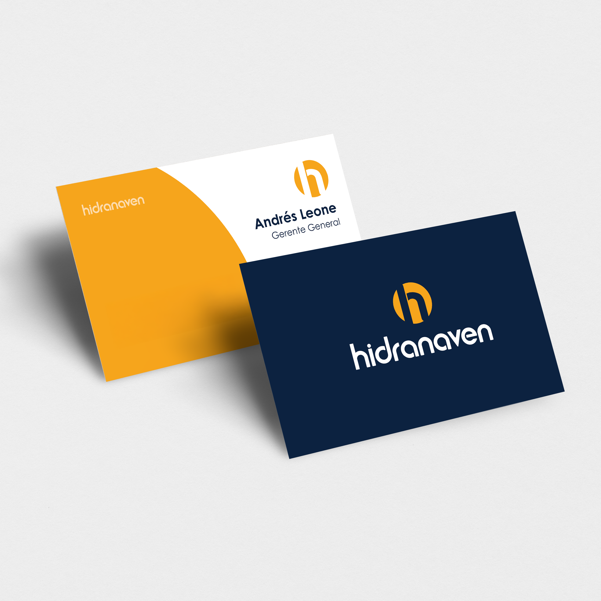
Hidranaven
This company has been a trusted player in the hydraulic market for nearly three decades. However, they needed a brand refresh to remain competitive in a crowded and saturated industry.
The goal
The objective was to develop a brand that felt modern, dynamic, approachable, and professional. They also faced challenges with their lengthy name and sought a simplified, recognizable, and memorable logo to strengthen their brand identity.
Scope:
Brand Design
The result
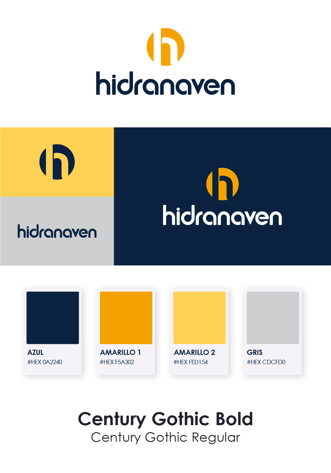
The final outcome of this project successfully addresses the initial objectives while overcoming the challenges presented. The result is a brand identity that is modern, dynamic, approachable, and professional—crafted with both recognition and longevity in mind.
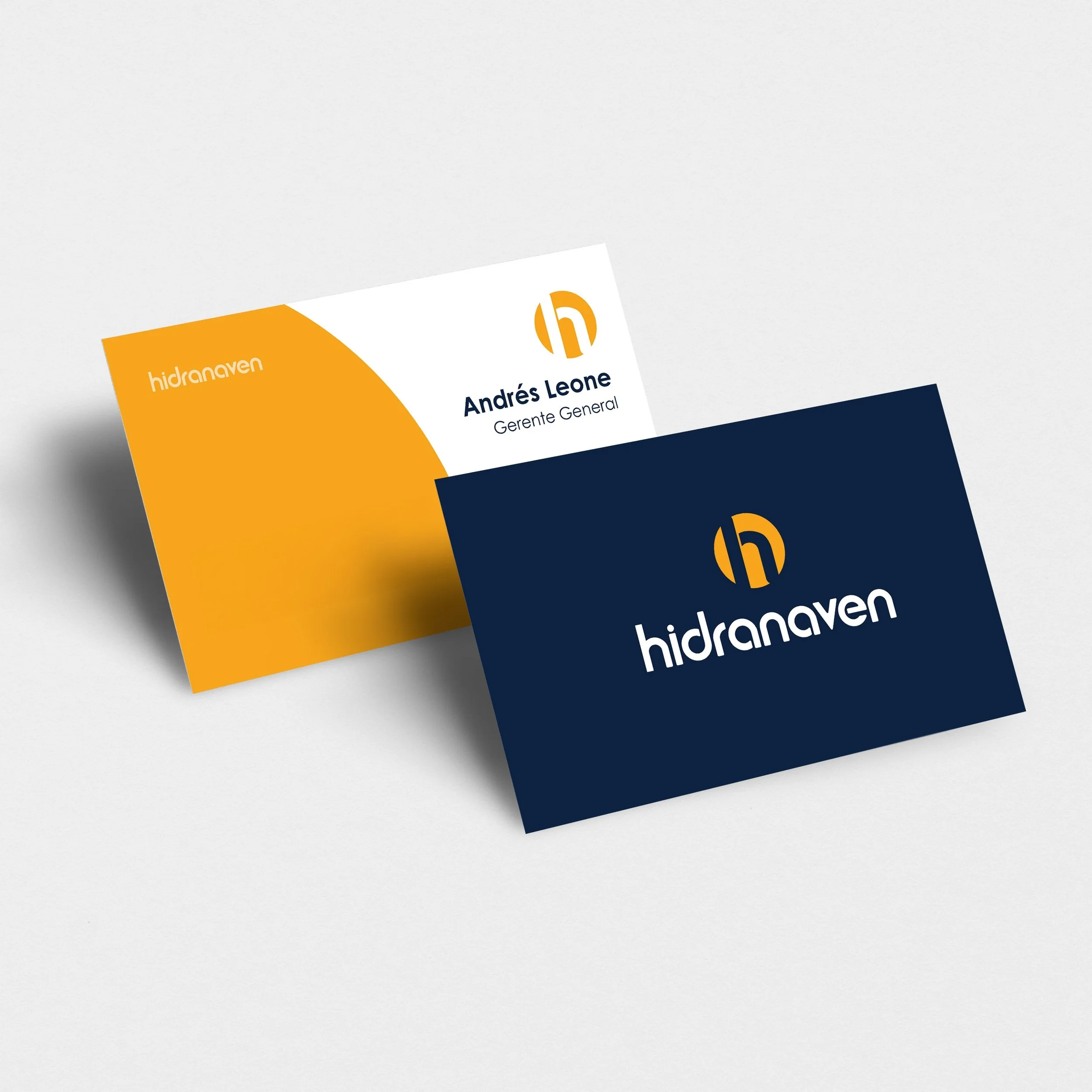
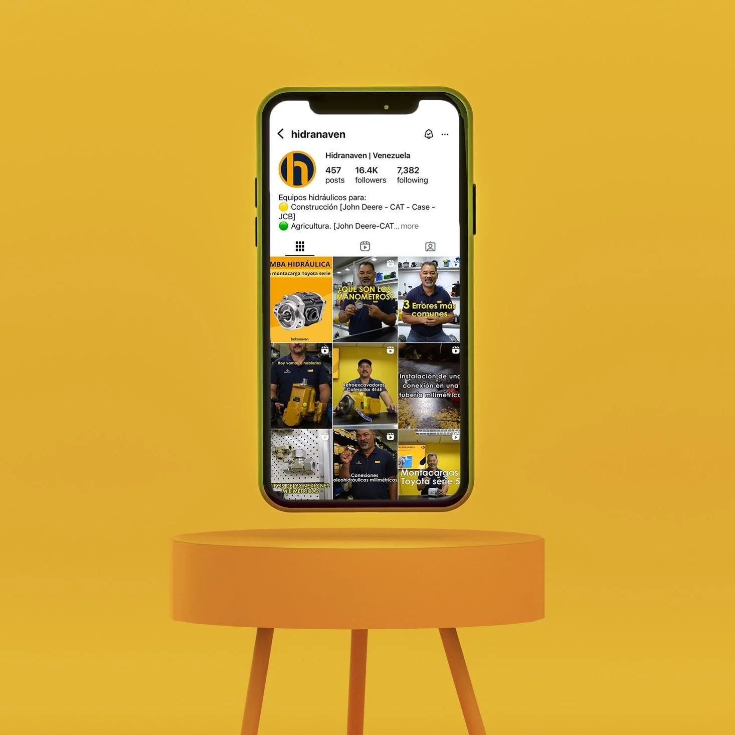
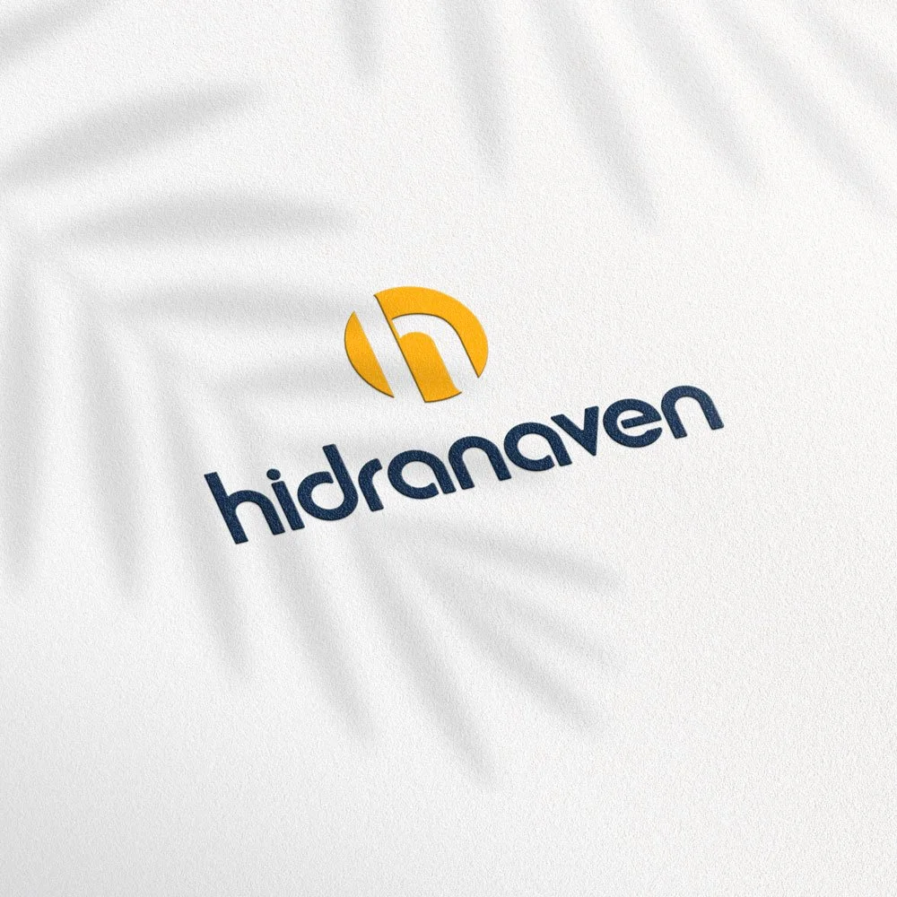
To enhance brand recall, a simplified and distinctive icon was introduced, leveraging the long-established yellow color that has been a key visual element for years. This not only maintains brand equity but also strengthens recognition across different touchpoints.
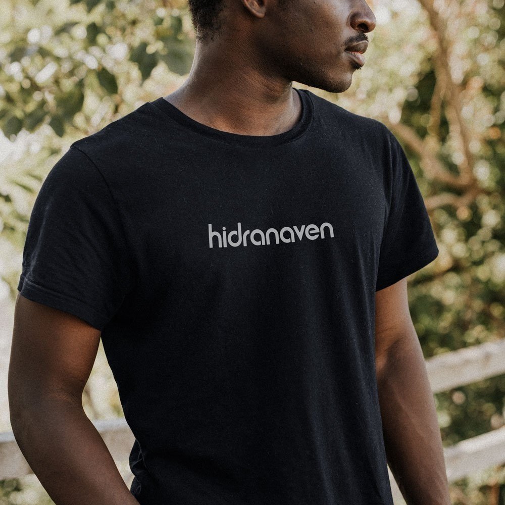
The challenge of the lengthy name was tackled through strategic typography choices. A lowercase font was selected to improve readability and accessibility, making the brand feel more welcoming and less rigid. Additionally, a strong contrast color palette ensures high visibility, allowing the brand to stand out in competitive spaces.
The selected colors are bold yet balanced, evoking an industrial and modern feel while also symbolizing the brand’s reliability and history. This combination reinforces the trust and loyalty the company has built over the years, creating a contemporary yet enduring brand identity that aligns with its legacy and future aspirations.